plan, execute, dominate
share

Category Archive: Conversion Rate Optimization

Website Conversion Bootcamp

If you are selling products online, you need to have landing pages instead of simply directing customers to your website’s home page. Why is this? It’s because your home page has to do many things – tell customers about your entire business and your entire product lines along with creating an atmosphere that tells the story of your business.

A specific product can get lost on a home page. Landing pages give you one place to direct customers to when they are searching for something particular. A great landing page creates a seamless flow to the product page from the ad or other point of entry that the customer used to get to the landing page. It should all feel like a natural extension of the same campaign.

Conversion rate optimization is all about finding out how to utilize landing page design to get people who visit your site and turn them into customers. But how do you do this? At eVisible, we use our years of experience to help customers develop powerful landing pages for their websites. Here are just a few of the practices that we’ve found can seriously improve a company’s website conversion rate:


BOOSTING CONVERSION RATES CAN BE A LAUGHING MATTER

Too many times, marketing experts translate their serious need to boost their conversion rates to the types of marketing they do. While it’s important to focus on letting customers know how you will solve their specific problems, this doesn’t mean that you can’t use humor to do it. In fact, when done correctly, a humorous marketing campaign can make deep connections with customers and lead to extremely successful viral campaigns.

Here are just a few of the ways that you can use humor in your marketing campaign with an eye on boosting conversion rates:


Use the truth: Customers often expect to get marketing speak and fluffy but pointless copy when they read a website or ad campaign. You can shock them out of this by appealing to them truthfully. Admit that your breath mint won’t cure athlete’s foot, make them wealthy or help them to marry a supermodel, but that it will make their breath smell better.


A matter of extremes: You can also take the opposite approach to attacking your conversion rate. Use playful exaggeration to showcase exactly how great your product is or counteract the claims of your competitors.


Two things that shouldn’t go together: Much comedy consists of humorous situations that arise when two things that should never go together suddenly come together. Think about Charlie Chaplin’s “Little Tramp” going somewhere like the opera. You can use incongruities to showcase key elements of your product.


The power of real people: Sometimes all you need to do to create compelling content is let real people be themselves. Some of the most powerful stories can come from customers or employees in unscripted settings talking about the strengths of your company and your products.


Parody for fun and profit: Don’t be afraid to make fun of elements of your business or your industry to make your point. Customers – even those within your industry – want to laugh at familiar things. They even don’t mind laughing at themselves if it’s done right.


Just have fun: Sometimes the best conversion tools are just plain fun. This can be a simple video game, a coloring book or some other fun gadget on your site that attracts attention.


SQUEEZE PAGES DON’T HAVE TO BE A DRAG

Squeeze pages aren’t listings for anacondas that are available to rent at children’s parties. They are landing pages that are specifically designed to solicit opt-in email addresses from potential subscribers. These emails can be used to send out newsletters, email announcements or prospect for new clients. However, just giving away some free information with the promise of more “if you send us your email” doesn’t work – people are just too jaded and protective of their privacy to give up their information.

Instead, you need to be sophisticated with how you construct your squeeze page. It needs to address a specific topic that you know your customers are interested in – in many cases, you want to propose a solution to a common problem. If you can back this up with specific numbers of how you solved the problem, this provides more credibility to your claims.

You need to construct the squeeze page thoughtfully. Start with a powerful headline that speaks to a customer’s problems. Add a call-to-action near the top that lets people know what to expect from the site. Informative videos can help to capture people’s interest. Make sure that you have several ways for people to opt-in at different points on the page. In short, give them a reason to opt-in and there’s a good chance that they will.


FIND YOUR UNIQUE VALUE PROPOSITION AND RUN WITH IT

Studies show that you only have 10 seconds to convince a customer to dig deeper into your website. This means that you have to hook them quickly if you want to convert clicks to cash. The best way to do this is to clearly communicate the Unique Value Proposition of your business – that is, what makes your company a clear choice ahead of your competitors.

How can you do this? Here are a few things to consider:

  • Think about what you want customers to feel about your business and convey that immediately.
  • Use language that addresses the customer directly and that avoids marketing slogans and jargon.
  • Along with discussing the features of your products, lay out how these features will benefit the customer.
  • Use real world examples of benefits and uses whenever possible.
  • Don’t use tired superlatives touting your business – no one believes these things unless you can back them up with proof.
  • Understand the problems that have led customers to search for your company and address these problems – and your solutions to these problems – head on.


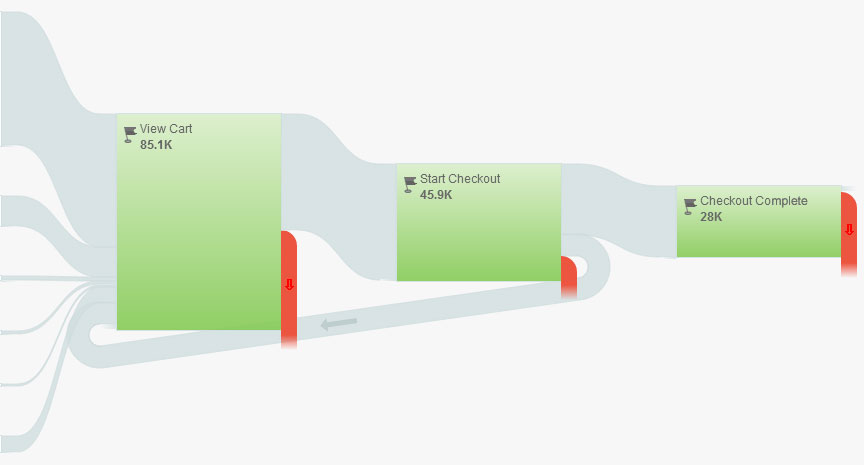
Once you have a Unique Value Proposition identified, make that a key component of your entire website. From your home page to individual product pages, reinforce this value proposition over and over again. You should even do this on action pages such as shopping carts to ensure that you close sales. And make sure that you evaluate what your competitors are doing – if their value propositions are vastly different than yours, it’s a sign that either you or them are not connecting with your customers.

Remember that context matters just as much as content when it comes to landing pages. You need to make sure that customers understand exactly how your products will benefit them in real-world terms. Telling them how you can help them is one thing – showing them is something far more powerful. No matter how you attack it, a powerful landing page is the best way to show customers what you are all about.

Taking Human Nature Into Account Can Increase Conversion Rates

Website visitors react to what they see in very predictable ways. Study after study has shown that how a person encounters a website will have a significant impact on how they react to it. Even with the exact same content, one website layout can increase the chances of conversions while another can make the site more vulnerable to high bounce rates.


A good rule of thumb to follow throughout your entire website layout and design work is to focus on what you want people to do on the page. A big part of conversion rate optimization is to understand the purpose of the page and getting people to have a laser-like focus on the page elements that will push them to do the task you want them to do. Whether it’s signing up for more information or making a purpose, every element on the page should drive a visitor to do just that.


human-touch


So how do you do this? Here are just a few of the ways that you can increase your likelihood for conversion rate success:

Limit Choices: Too many choices can leave website visitors paralyzed by options, so they wind up doing nothing. Instead of giving visitors multiple different forms to fill out, limit them to one choice. Instead of having all of the different social media sites listed with sharing buttons, limit the page to the few sites that make the most sense for your customers.


Top to Bottom, Left to Right: People read websites like they read newspapers. This means they expect the most important information to be “above the fold”, i.e. above the first half of the page. They also are used to reading left-to-right, which means that you want to make sure that valuable information is on the left side of the page. Keep calls to action and other secondary content on the bottom half of the page. If a person scrolls to this part of the page, chances are that they are ready to take the next step.


Headline Sizes Matter: People are attracted to big, bold headlines that spread across the screen from the top of the page. Design your site so the most important information is encapsulated within a headline at the top of each page.


Use Images: Especially of people. Studies have shown that website visitors react particularly strongly when they see pictures of people on a website.


Think About Usability: If a person can’t navigate your website, they’ll click away rather quickly. Avoid this by utilizing a clean layout with a solid color contrast, plenty of white space and an avoidance of overstuffing the pages with too much clutter.


Keep Ads and Sidebars Away From Main Content: Whether you are selling ad space on your site or have internal links to other pages on your site, you want to keep these elements apart from your main content. Have a clear delineation between the main content and any sidebar content that might pull people away from your main message.

Finding the Formula for A/B Testing Success

If you are running PPC ads, you need to be performing A/B testing on a regular basis to ensure that your ads are performing as well as they should. A/B testing gives you a way to test different elements of an ad to see if changes improve or harm the clickthrough rate. Doing this is a critical step to keeping your ads fresh and improving your performance. In fact, when you hire a PPC management expert to help with your program, A/B testing is one of the first things that they will likely recommend.


good-vs-bad

A/B testing might seem complicated, but it’s something that anyone can accomplish. We’ve put together some easy steps to help you to do your own A/B testing and improve the performance of your PPC ad campaigns:


1. Determine the highest-performing ad from an ad group that generates a high amount of traffic for you. You’ll want to focus on ads that have already proven to be successful to see where they can be tweaked.


2. Put the original ad on hold and make a pair of duplicate copies of this ad. From there, make a pair of tweaks to perform the test you want to accomplish. This can mean changing the text from “all caps” to all lowercase, using different images or color elements.


3. Halt all of the other ads in your ad group so only the ads that you are running A/B testing on are live. Make sure to label these ads with their date and the changes made in AdWords.


4. Make sure you have “Optimize for Clicks” selected in AdWords to get the most accurate results.


5. Let the ads run for a lengthy period of time before you start to try and collect any conclusions. You’ll want to get several weeks’ worth of data and hundreds of ad impressions before you have a data sample size that is large enough from which to draw conclusions.

You Won’t Believe the Ways We Know to Make a Powerful Headline

Creating a powerful headline is important — maybe even more important than you think. According to recent research, 80 percent of people will read a headline on a website, but only 20 percent of these people will actually read the article. The quality of the headline can make a big difference between the articles that are read versus the ones that aren’t.

So what makes a compelling headline? The team behind eVisible content writing services knows that there’s no “magic bullet” to assure that headlines will grab your readers’ attention. You’ll need quite a bit of trial and error to discover the type of headlines that will resonate with your target audience but doing it properly can pay significant dividends.

powerful-headline

Don’t Be Afraid to Get Creative: A boring headline — even if factually accurate — isn’t going to drive people to your content. Any fears about using clever or “cute” headlines to draw in readers have been proven to be outdated with the rise of viral sites that get huge click-through and page view numbers with creative and witty headlines.

Consider Your Target Audience: It’s important to think about who you want to read your stories and what you want them to do when crafting a headline. If you are looking at closing sales, you need a headline that calls the reader to action. If you are simply looking to increase page views, you need to focus on grabbing their attention with the promise of something unique in the story text.

The Medium Matters as Well: You need to consider who your readers will engage with the headline when creating it. Sites such as Facebook allow you to use an image and, possibly, some additional “teaser” text as a sub-headline to attract a potential reader’s attention. Make sure you take advantage of these opportunities when you can.

Remember That People Are Curious By Nature: There are several types of headlines that have become popular in recent years:

  • Lists
  • Questions
  • How-Tos
  • Directly Addressing the Reader

But one of the most popular recent trends has been in headlines that use shocking language, over-the-top statements or emotional responses to get readers hooked. This is particularly true of viral news sites, which often use headlines such as “This Picture Shows Why Our Education System is Doomed” or “You Won’t Believe Why This Woman Was Sent to Prison for 20 Years.” They present bits of information that connect with people’s emotions and lead them on to want — and almost need — to click through to find out more. It’s powerful, effective and is a method that can make your articles go viral.

Steps to a Solid eCommerce Checkout System

One of the easiest ways to make more money from your online business is to improve the flow of your eCommerce checkout system. You need to make it as easy as possible for people who are browsing for products on your site to make a purchase. There are many ways to improve this flow rate, but even a slight improvement in conversion rate optimization can lead to a significant increase in profits.

The specifics of how to improve your conversion rate will be unique to your website. You’ll need to do conversion testing and reporting to fully understand what it means for your site. But what motivates a person to decide to make a purchase from a website is universal. Roughly stated, a person makes a purchase because they are motivated to buy a product, have the immediate ability to make a purchase and have been “triggered” to buy.

solid-checkout-flow

Getting people motivated and triggered to make a purchase can be as simple as sending out an email and having them click through to your product page. But it takes professional website development in order to give a customer the easiest path to purchase. One secret is to make sure that a customer gets an item into their shopping cart as quickly as possible. This gets them out of the mindset of “just browsing” since they are now officially “shopping.”

It’s important to make it as easy as possible for a person to add something to their shopping cart. The purchase button should be as big and obvious as possible. Once a person adds something to the shopping cart, it should be clear that they have something in the cart. And you need to make sure that the customer can see how to go to the shopping cart to enter in their payment information and complete the purchase at any time.

From a web design standpoint, you also need to consider what happens when a customer gets ready to make a purchase. One consideration is whether or not you require customers to register before buying anything. As a general rule, forcing customers to register creates a barrier that could very easily lead to them not making a purchase. You’ll also want to make sure that you don’t ask for credit card information until the last step in the process. Get all of the shipping and personal information first so that the credit card information is easy to get.

These are just a few of the things that you’ll want to do when you think about your eCommerce set-up. eVisible can help you design an eCommerce system that is right for your industry and business.

Five Easy Steps for Turning Visitors Into Customers

One of the most important but often overlooked parts of any SEO campaign is landing page optimization. This is the process of making sure that your landing pages – i.e. your home page and other key pages on your site – are designed for SEO success as well as to convert visitors to customers. You can see why this is so important – after all, what is the point of getting customers to your home page if they are going to leave your site before they buy anything?

convert visitors into customers

Even though it’s apparent that increasing your landing page conversion rate is critical to the success of your site, not everyone knows how to do this. To help you out, we’ve compiled five easy steps to help turn curious site visitors into happy customers:

Customer Validation: Potential customers want to see that people just like them have had positive experiences with your products or services. You can let your past sales work for you by aggressively seeking testimonials from your customers and posting them prominently on your website.

Make Customers Feel They Are Missing Out: The “herd mentality” is a real thing when it comes to online marketing. Customers are more likely to purchase your product if they feel like other people are doing the same thing. Call if safety in numbers or not wanting to miss out on the next big thing. You can play to this by showing how many people have recently purchased or tried out your product or offering.

Customize Your Pitch: Customers want to feel like they are special and not just one of the many people receiving a sales pitch. There are many ways that you can customize your sales pitch to reach out to customers on an individual basis. You can use software to insert a person’s name or hometown, or send a different pitch to male or female customers.

Keep Access Limited:  What’s the best way to get people curious about something? Keep it hidden from them. You can do this with your online content as a way to get customers interested in what you are offering. Give them a little taste of some interesting content but ask them to send their email address to you in order to read the rest.

Speed Matters: Don’t overlook the speed of your website. If your website is slow to load, potential customers might give up and go to a different site.

Five Ways to Balance Your Website’s SEO and Usability

Using SEO tactics to get customers to your website is great. After all, people need to find your site in order to use it. Companies know this – it’s why many spend significant amounts of time and resources on professional search engine marketing. However, getting people to visit your site is only part of the battle. If the content is weak or poorly written, or the layout is distracting and confusing, what is the point?

It’s easy for a web development consultant to spend so too much time worrying about SEO considerations and not enough thinking about customer usability; this often leads to websites that rank highly with search engines but have low conversion rates when it comes to translating web views into actual sales.

seo and usability

Don’t fall victim to this short-sighted approach to web development services. Instead, utilize these five tricks that will help boost your search engine rankings while also improving the interface and user experience for your customers:

Know Your Customer: There’s no such thing as the “typical” customer. But by doing some market research. you can understand what drives a potential customer in your category to make a purchasing decision. Remember that a website that works for one type of business might not be appropriate for another business.

Make Your Content Have a Point: The content on your website isn’t just there to fill space or serve as filler between optimized keywords. Think about the types of questions that you customers might have and design your text to clearly answer these questions.

Keep Graphics Simple and Clean: It’s easy to try and go overboard with graphics, colors and other design elements with laying out your website. After all, you want your site to be memorable and eye-catching. But in many cases, this means that your website will also be distracting and keep people from finding the links and information they need to make a purchasing decision.

Make Navigation Easy to Follow: One of the main reasons that people leave a website before making a purchase is because of poorly development site navigation. If they can’t easily find a link to the information they need, they’ll likely leave and try out a competitors’ site. Check your website design and make sure that customers can quickly get to the pages that lead to sales.

Track and Change: The work isn’t done when your website goes live. You need to track visitors, clickthrough rates and sales to determine what does and doesn’t work and make changes quickly if necessary.

Five Surefire Steps to Improve Organic Clickthroughs

SEO practices can go a long way in impacting your Search Engine Results Placement (SERP). Producing the right content and using best SEO practices such as authorship, site links and social signals can improve the SERP display of a website page on a search engine query. But this is only part of the battle. In order to profit from a high SERP, you need to be able to get people to click through to your link. With higher SERP conversion, your high-ranking link is as worthless as one that is at the bottom of the search engine rankings.

SERP conversion is often an overlooked element of search engine optimization. However, it should be an important part of any SEO conversion strategy. Organic clickthough strategies are proven to lead to an increase in highly targeted and motivated visitors to your site who are ready to make purchasing decisions. Ultimately, that’s the goal of any online marketing campaign – get qualified leads ready to buy to your site.

improve organic clickthroughs

Over the years, we’ve developed many different strategies to improve organic clickthrough rates. The right strategy for you will depend on your unique position, but these five strategies have been proven to work over time:

Rich snippets such as ratings, number of total reviews, price range and contact information can go a long way in getting people to click on a link. This is even more powerful when combined with strong calls to action to “see pictures” or “read unbiased reviews.”

Building a brand through offline tactics can help your SEO strategy. Google rewards links associated with known brands. Running contests and offsite promotions are some of the ways that you can create positive association with customers and get them interested in clicking on your link.

Harness multimedia by going beyond text. Create videos and use attention-grabbing images. Make sure to caption and tag them for full optimization.

Optimize your site by reviewing your internal linking strategy and site structure. Research how customers are viewing your site so you can create breadcrumbs in your search results.

Take ownership of your content by attaching your company’s name – or your name – to the great content you are creating. It establishes credibility with searchers and helps with your Google ranking.